|
We've all heard by now about animals shifting their ranges poleward and/or uphill, which has been seen not just in traipsing large mammals but also in more parochial species like insects and fish. Over the last few decades, this progression has been on the order of 1.7 km poleward and 1.1 m uphill per year. [Using a standard estimation of the lapse rate as about 6.5 deg C per 1000 m, this implies an altitude adjustment rate of 0.72 deg C per century, which is quite similar to the observed rate of warming in the atmosphere since 1900 (using GISS data). Estimating the annual-mean equator-pole temperature difference as 50 deg C (equivalent to about 5 deg C per 1000 km) implies a latitude adjustment rate of 0.85 deg C per century. Always gratifying when these back-of-the-envelope calculations imply something reasonable — in this case, that species are shifting their ranges uphill and poleward at the same rate with respect to temperature, and that this leading edge is keeping pace with the warming.] The complete picture is not quite that neat, though: there is also evidence that the equatorial bounds of ranges are shifting less than the poleward ones, if at all. The figure below shows some evidence that the hot end of a climatic range is better tolerated than we would theoretically expect (whereas from the same study the cold end is, empirically, a harder limit).  A comparison of the lab-measured thermal tolerance of a variety of species (determining their placement on the y-axis, and with their latitudinal ranges shown in green) against the highest temperature recently observed in each latitudinal band. While a gross simplification, it makes the point that most species (if not individuals) have likely experienced temperatures in their native habitats exceeding those they would theoretically be expected to not survive. Source: Sunday et al. 2012, supplement. Given the intriguing findings above, I was curious about whether these concepts had any applicability to humans. After all, despite all our trappings of civilization and thus limited exposure to the unadulterated elements, humans resemble other animals in key ways: we are thermally sensitive, and we acclimate to the climate around us, so that where it's cold we die more from heat and where it's hot we die more from cold (also see top two figures in the panel below). In the U.S., heat is usually considered deadlier than cold as tallied up by the National Weather Service, but in fact a meta-analysis of 74 million deaths published in The Lancet earlier this year found exactly the opposite: for the regions considered (primarily also in the mid-latitudes), cold has killed many more people than heat in the past 30 years. Another interesting finding was that much of this excess mortality was associated not with the (rare) most-extreme temperatures, but rather with the more-common yet still anomalous ones. This pattern held up geographically as well: it wasn't Canada that had the most deaths from cold, or Thailand that had the most deaths from heat, but rather (of the 13 countries examined) China and Italy respectively. Together, these findings go against many of our presuppositions about the effect of extreme temperatures on society-wide health. Italy is generally considered an epitome of a benign and temperate climate! One hypothesis that occurs to me is that it is the rate of variability that matters most, more than the absolute temperature: too fast and animals' body temperatures stay low, they can burrow into the soil, avoid activity, etc; too slow and acclimatization cuts into mortality. This could be a partial explanation for why the animal species in the figure above were evidently able to survive extreme heat when they 'shouldn't have.' A major caveat on the human side is that the limited data from tropical areas makes it unclear if the pattern in Thailand, Taiwan, and Brazil — more deaths from cold than heat! — is accurate, and if so, if it's global. Because of the much greater amount of moisture, the maximum temperatures are lower in tropical environments than in the arid subtropics, though the wet-bulb temperatures are typically higher... More empirical studies are needed because intuition doesn't provide much of a guide here. It's certainly a complex story — not surprising when finely tuned and highly responsive biological and climatic systems are thrown into opposition. But again, the human-mortality data back up the idea that under CO2-driven warming the tropics stay reasonably habitable even as the high latitudes become less uninhabitable.
 Percentage of all recorded deaths attributable to temperatures that were 'moderately anomalous' (simply warmer or colder than optimal) and to extremes, for the period 1985-2012. Note that overall about 7.5% of all deaths were attributable to temperature as the immediate cause. Source: Gasparrini et al. 2015. Considering the above, all other things being equal we would expect the line of minimum mortality to shift poleward in a warming climate (with many complications for possible changes in temperature variability, storm tracks, moisture levels during the hottest events, etc). U.S. cities with the lowest vulnerability to climate-change impacts are generally in the North, even after taking out the heat-stress component, due in large part to anticipated water shortages. Together with the findings of the Gasparrini et al. study, and factoring in things like the wicked heat observed in parts of the Persian Gulf, maybe the (expanding) subtropics are the most-marginal places currently inhabited, and in that case will be the toughest to remain in. The overall uninhabitability crown will surely be kept by the Antarctic interior, though, which even with exceptional warming will stay bitterly cold.
Going back to the very first sentence of this post, another one of the truisms about climate change is that it is in effect more of a redistribution — of heat, of moisture; in short, of suitability for life — than anything else. This is of course appropriate given that the same could be said of the entire climate system itself. Without redistribution, there'd be local ('radiative') equilibrium, which would look a lot different than what's observed (in the linked figure, E is for Earth observations). The projections for arable land resemble those for mortality, the only difference being that they are based on physiological stresses on plants rather than animals. Again, increased temperature and its corollary, increased aridity (via the vapor-pressure deficit), are the main culprits in losses of arable land in South America and Africa, but globally arable land will likely increase moderately due to gains in the highest latitudes. In the absence of large-scale latitudinal migrations much larger and unlikelier than those discussed in the previous post, and barring any major technological breakthroughs, this shift in regions of agricultural and hydrological suitability over the 21st century away from regions of high population growth — and toward ones of slow or negative growth — means that the cities of tomorrow will have to be supplied by another resource redistribution of similarly massive magnitude.
0 Comments
No matter what emissions scenario the 21st-century world ends up following, no matter what climate sensitivity turns out to be most accurate, no matter what geoengineering projects might be taken up, there will inevitably be places that experience huge disruptions as a result of climate change. This is not a radical statement, but one drawn on shifting probability distributions: even a marginal increase in the chance of some environmental *thing* happening due to increased greenhouse-gas concentrations implies an (equally marginal) anthropogenic fingerprint. Once the environmental part is attributed in this way, a whole slew of cascading effects can be as well. Of course, for some things (sea-level rise) it's a lot easier to say whether or not they would have occurred had we all stayed peasant farmers — or if we'd somehow skipped the coal-and-oil phase of industrialization and gone straight to renewable energy — than it is for others (specific extreme events). A thoughtful article comparing these definitions and reflecting on the challenges the whole interconnected system poses is here.
 A sample of the challenge in attributing extreme events, in this case the recent California drought: The probability density function of water vapor over the northeast Pacific in the 1871-1970 period (blue) and 1971-2013 (red). The black bar marks the combined 97.5th percentile. Source: Herring et al. 2014. Disruption requires coping. Almost all coping strategies (conventionally divided into adaptation and mitigation) are predicated on the notion that incremental modifications in barriers, policies, building codes, technology, etc. will be sufficient to maintain society-wide quality of life at the same level and, crucially, in the same places. Conceding anything to Nature, even strategically, is a mark of weakness. In a way, this is a continuation of the view since time immemorial of humans as underdogs against an enormous and unforgiving natural world that must always be beaten back — a view that arguably needs adjustment given our modern technological arsenal and general omnipresence. (I recently read Bill Gail's "Climate Conundrums" which does a nice job exploring this perspective.) To be sure, the incremental-adjustment paradigm will be reasonable in most cities, with major impacts restricted to low-lying neighborhoods and certain regions. The changes must also be placed in the context of the long-term history of cities, which as expressions of their volatile creators are never finished becoming, But take off the big-picture glasses that pleasantly smooth everything out, and there are most certainly areas that despite all reasonable efforts and expenses will suffer greatly, if not become completely uninhabitable. Coastal Alaska is one such place, due to the combined effects of increased erosion and rising seas. Even small villages have relocation costs in the millions, and so it's hard to imagine the untold sums associated with "only" parts of a city like Miami being reclaimed by the ocean (the below figure giving a taste for the numbers). It's a bit of a cruel twist on the term 'underwater mortgage.' In the past, abandoned places have ranged from the Sahara Desert (as it transitioned from grassland) to Pripyat after the Chernobyl disaster, as I mentioned on the Background & Stats page. Astute readers will have noted that in the litany of adaptation issues proffered by the IPCC, the very first under 'Infrastructure/settlement' is relocation. This is an interesting choice — perhaps intended as a political statement of seriousness — instead of emphasizing, say, seawalls, water pipelines, and air conditioning. Whether 'climate-induced migrants' eventually number in the thousands or the millions, and whether they are moving between neighborhoods or between countries, the question of what precedent to set is an important one that will be a subject of negotiation at the Paris climate talks next month. Beyond normal humanitarian aid, a reasonable approach would be to make assistance for those most affected proportional to the probability (using historical-climate simulations) that the aspects of the event that caused the suffering were attributable to greenhouse-gas emissions, and then break the assistance down further by countries' integrated historical contribution to current CO2 levels. All a pipe dream of fairness, probably, but one can hope.  Projected sea-level rise from 2000 to 2100, ranging from purple (reduction) to red (+4 ft), and the top 5 major cities threatened by these changes. Source: National Geographic, Rising Seas project. Finally, entertaining the notion of city relocation brings up for debate questions about regulation vs. individual freedom — literally, in the case of building along low shorelines, about sunk costs. Should society (through disaster relief, insurance subsidization, etc.) be encouraging and enabling continued investments in vulnerable places? How vulnerable is too vulnerable? Non-sea-level-related changes (like extreme heat and water shortages), while certainly formidable, will probably prove easier to address in situ than relocating millions of people. In many cases, ameliorative technologies new (desalination plants) and old (traditional Arabic city design) are available and simply need to be effectively scaled up, and as demand rises costs will continue to fall.
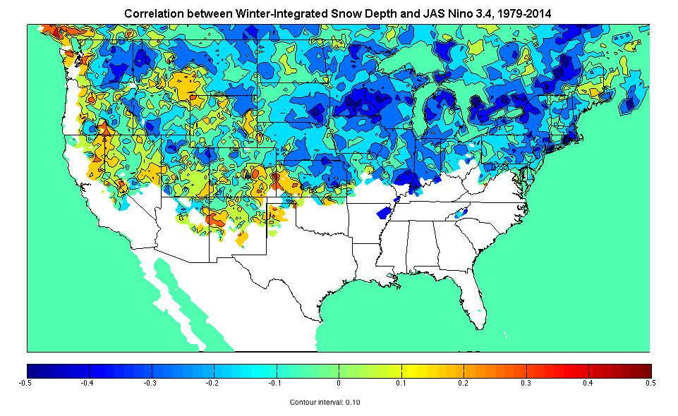
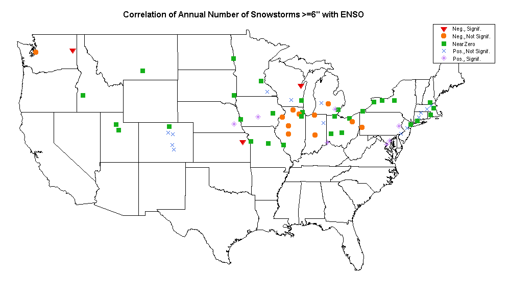
When it comes to our interactions with the environment, the 'fight or flight' instinct is just as applicable on a global environmental scale as it is when facing a threatening animal. A judicious mix of them will have to be employed, and flight occasionally resorted to, although the fighting will no doubt comprise the vast majority of our adaptation efforts. If nothing else, our stubbornness in insisting on continually living life in parts of Earth where conditions are poorly suited for it will be good practice for when we begin colonizing other planets. The NOAA Climate Prediction Center released its winter temperature and precipitation outlook recently, and their expectations for generally warm and dry conditions across the northern half of the US, and cool and wet conditions across the southern half, bear the fingerprints of a strong El Niño (the Jul-Aug-Sep sea-surface temperature anomaly in the Niño 3.4 region of the east-central Pacific was the 3rd-highest on record). Recent values of the Arctic Oscillation and North Atlantic Oscillation indices (which tend to track each other) suggest that at least in the early part of the winter, the NAO/AO temperature effects will tend to counterbalance the ENSO-related warming in the northeastern quadrant of the country, while accentuating it in the south-central part. [The AO and NAO are high-latitude patterns of variability, while ENSO is tropical; ENSO's two phases are for historical reasons called El Niño and La Niña.] The negative NAO/positive ENSO combination also means it's likely that the Eastern Seaboard "nor'easter" track will be active. Although these broad temperature and precipitation correlations are well-established, translating them into exact predictions for point locations -- even for seasonal totals -- is notoriously difficult, and that is nowhere more true than with regard to snowfall. NOAA provides the disclaimer: This seasonal outlook does not project where and when snowstorms may hit, or provide total seasonal snowfall accumulations. Snow forecasts are dependent upon the strength and track of winter storms, which are generally not predictable more than a week in advance. However, I was curious to see if the signature of ENSO (as the dominant anticipated modulating effect on the upcoming US winter) could be seen in the observational data for the cities with populations greater than 100,000 that participate in my annual snowfall race. Caveat lector! What is the relationship between the 'snowiness' of a winter and ENSO? In the maps above (click to enlarge), blue (red) areas see less (more) snow on the ground in El Niño years. Winter 2015-16 can best be predicted by some combination of these two images given that JAS SST anomalies were equally strong in Niño 1+2 (east Pacific) and Niño 3.4 (east-central). Integrating snow depth over the entire winter means this measure takes into account both the amount of snow that falls and how long it lasts before melting. Areas with snow cover on fewer than <3% of days are masked out. The correlations are very similar in sign and magnitude for SON and NDJ values as well. The percentage of variability is not terribly high anywhere, but this is of course the predestined fate to which most analyses using observational data are resigned. Still, in El Niño or La Niña years, it means reasonably accurate seasonal snow expectations can be formed as soon as the September ENSO values are out.  Looking at seasonal snowfall totals, clustering the cities gives a pretty fractious picture, underlining that the local deviations from the broad expectation can be more important than the expectation itself. For the red cluster, positive ENSO phases are associated with statistically significant greater-than-average snowfall to 95% confidence; for the gray cluster, they're associated with less. Restricting our eyes to the red and gray clusters only, then, reveals something broadly consistent with warm and dry conditions in the northern third of the country, and the faint suggestion of increased snow on the northern side of the southward-displaced storm track through the Ohio Valley and Mid-Atlantic regions. This is based on 65 years of data; another 65 would go a long way toward moving the mass of non-significant points into one camp or the other. Pivoting toward a measure that's more clearly relevant to the coming winter, I also wanted to look at the number of snowstorms in El Niño vs. La Niña years. Just in direct costs these events can be non-negligible chunks of municipal budgets: removal is roughly $0.22 per person per inch in New York City, or $11 per person annually for a city with 50" of snowfall. In the high-snowfall winter of 1977-78 in Illinois, a study used surveys to estimate the total cost associated with snow as about $2.50/person/inch converted to 2015 dollars. A single event can cause something on the order of $20/person in lost productivity, though this is admittedly very rare, and such calculations have been the subject of dispute. I chose 6" as the cutoff because most cities in the race average at least one such storm per year, and it's hard to do statistics on a column that's 90% zeroes. Much like the the previous map, this one uses JAS Niño 3.4 anomalies, and again most correlations are non-significant (click to enlarge figures in the gallery). Somewhat greater spatial coherence is apparent, though, with the Ohio-Indiana-Illinois-Michigan area of reduced snowfall corresponding well to the dry area in the prediction for the coming winter. The main region of statistically significant increased snowfall spans from Cincinnati through Washington and up to Boston, consistent with the area that under El Niño conditions sees near-normal temperatures and normal-to-above-normal moisture. The Front Range cities of Colorado may fall into this category as well but there is not enough data to separate this supposition from the result of the total-snowfall clustering. The takeaway is that if you live between Fargo and Columbus, or in Spokane, you're pretty safe betting your friends it'll be a below-average snowfall year. The Washington-Baltimore area especially should be on the lookout for more snowstorms than usual. Of the whole country, the place where we can have the highest confidence in anything is that Florida will be cool and wet — but no amount of coldness and wetness is going to earn it a place in these snowfall tallies.
It's long been a yearning to be able to glance at a forecast and step out the door knowing that the weather won't suddenly 'turn' in the hours that you're gone. This applies to decisions large and small: Is there time to get to the top of the mountain before the thunderstorm strikes? Or to run to the store without an umbrella? How much snow will fall this morning, and so should there be a snow day? Is it safe to go out deep-sea fishing today? Looking at charts of improvement in forecasts over time might seem to suggest that real-time forecasts should be just about perfect. And indeed they are —— if what you care about is the general circulation of the Earth in the mid-troposphere. As for how that translates to conditions at a point down on the surface surrounded by the complex natural and manmade geography that characterizes the environment of the city-dweller, the picture is not quite so clear. There is a downward trend in forecast errors for tropical storm landfalls, for instance, but this figure and the last both show a decreasing rate of improvement —— bringing to mind (somewhat dishearteningly) Zeno's Progressive Dichotomy Paradox. On the other hand, the tidal wave of data enabled by the proliferation of Internet connectivity gives a lot of reason for optimism; the challenge, like with most other Internet-related problems, is extracting what's relevant from amidst the vast amounts of chatter. A Shanghai-area meteorological network has served as a major proof-of-concept in quick turnaround from mass data ingestion to nowcast output. Automated tracking of weather systems and efficient ensemble (multi-model) and statistical (multi-event) approaches for pinning down rapidly evolving features like thunderstorms have proven their worth at major events like the Olympics and World's Fair where it's cost-effective to bring in the experts, apply the high-resolution models, and deploy the necessary equipment. It all goes back to basic principles like advection and latent-heat release, but the sophistication of the approaches results in forecasts far more accurate than what could be done by extrapolating out a few hours with pencil and paper. It will be very interesting to see how machine learning can further reclaim the 'forecast-able' from the 'inherent chaos'. Smartphones are of course the prototype of large-scale data-gathering, given their basic sensors that various apps have exploited to plot dense real-time street-level temperatures, humidity, and sometimes other variables for just about any city in the world (as in the second figure below). A glance reveals that data quality is a significant challenge -- long-running debates on climate change, for instance, hinge on errors that are no more than 1 deg C. And, somewhat counterintuitively, such errors can be more important in nowcasts (~hours) than in forecasts (~days or weeks) where the initial conditions matter less. The same principle applies to coming-years versus century-out projections as shown in this classic figure (where internal variability effectively represents initial conditions, and two possible realities are compared). On the other hand, the first figure below is from a webpage where users submit their observations of current precipitation type at their location, much like CoCoRaHS but qualitative and in real-time. This is presumably more accurate than what any cheap sensor could detect; the tradeoff is that the quantity and thus density of observations is orders of magnitude lower. Whether either of these is preferable to the other, or to the medium quality and density of say Weather Underground's network of private traditional weather stations, probably depends mostly on what question is being asked.  User-defined precipitation types over a 6-hour period in February 2015 as part of the Meteorological Phenomena Identification Near the Ground project. Source: http://mping.nssl.noaa.gov/display/  Real-time temperatures as measured by smartphones with the WeatherSignal app in Cape Town. Source: http://weathersignal.com In terms of other automated observations, automobile-sensor networks that actively transmit meteorological data to be shared and analyzed with a larger purpose than decorating your dashboard with a temperature reading have been technologically feasible for a while, but so far sensors have mainly just reported on traffic conditions; the probable first widespread weather application will be in fog alerts. Fog is ephemeral and mainly a hazard only for drivers. A patent evidently purchased by Google reveals that automated ice detection on roads has been considered since at least 1978, but as of 2015 it's still best classified as a 'vision'. As an aside, one big question to come of all of this is the importance of data vs. intuition -- a recurring theme in this field. Psychologists are ambivalent about whether more information helps people solve problems; on the other hand, from personal experience, I can say that to be able to beat algorithms in daily weather forecasting people need to have the algorithms' results first -- but if they do, they can triumph reliably, although only by tacitly accepting the algorithms' general interpretations. Many consulting services have emerged catering to events with short-term forecasting needs arguably best served by a blend of advanced algorithms and expert judgment, often supplemented with special high-quality measurement sites. Will 'experienced' algorithms mature in their decision-making like experienced people? Or will they struggle to separate wheat from chaff? If real-time weather decisions are anything like real-time driving decisions, then perhaps it will prove to be a balancing act.  Simulation of a plume in downtown Denver five minutes after release, with color proportional to concentration. Winds are measured by lidar on the city scale, interpolated to the building level with one set of models, and filled in between buildings with another. Source: Warner and Kosovic 2010, "Fine-Scale Atmospheric Modeling at NCAR." In the end, however, algorithms and machine-learning techniques literally are what they eat, in that they are only as good as the data they are fed —— and though lots of data is now out there due to the sensors in our pockets, not nearly enough of it is cleaned to make it of sufficient quality to use in operational nowcasts. Air pollution and wind modelers have seen very good results in simulations using urban 'schemes' (physics and chemistry packages), which can get down to a less-than-10-m scale, attached to standard high-resolution models like WRF (see figure above). However, they require commensurately high-resolution building, vegetation, anthropogenic-heat, soil-moisture, etc information, and also often special tools like lidar for verification. Good in small spatial windows, not so good in small temporal ones. Consequently, in the best operational nowcasts, put out by the Weather Prediction Center, about 1/3 of the area gets the predicted amount of rain (here, 0.25"-0.50") —— so you can expect to keep getting caught in the rain, or lugging your umbrella around in the sunshine, for many years to come.
|
Archives
September 2023
Categories |


 RSS Feed